Making complex data actionable: redesigning the lead journey timeline

CallRail 2024 | Drove Adoption + Engagement
Hebe Zheng (Lead Product Designer), Heather Lutz (Senior Content Strategist), Grant Sadowski (Senior Product Manager), and the Experience Engineering team.
Summary
Jan - Feb 2024
Context
Timeline is CallRail’s third most visited page, meant to show a lead’s full journey, from initial website visits to the eventual contact. But the dense data made it difficult for users to identify what mattered, connect attribution data to business outcomes, and extract actionable insights.
Outcome
Post-launch surveys: 58% rated it positively. The redesign drove 48% first-week call recording activation and 44% AI upsell conversion, making it one of CallRail’s highest-performing placements.
My Role
As Lead Product Designer, I owned the work end-to-end, from framing and research synthesis through onboarding strategy. I partnered with Product and Growth leadership to balance user and business goals.
Problem
Users doesn't understand the data
The Timeline page presented every session and touchpoint in a dense and undifferentiated log, so users still couldn’t answer a basic question: what led this person to contact us? When users cannot connect conversions to marketing, Timeline feels less credible and valuable, which can hurt retention.
Constraints
Three factors shaped this work from the start:
  • The core data model could not change.
  • This is a high-traffic surface, so changes had to improve clarity without adding friction at scale.
  • The page had growth goals, including surfacing AI features for upsell.
Design thinking
Help users connect the dots
The Timeline already captured the right information, so the solution had to come from structure, hierarchy, and visual clarity. The goal was to help users quickly understand what happened and why it mattered, without requiring them to reconstruct the story themselves.
Key decisions
  • Clarity over completeness in a data-heavy interface
  • Attribution users can understand at a glance
  • Explicit limits on growth surfaces to protect usability
Provide high-level lead insight at a glance
Research showed users wanted to immediately grasp the lead’s journey. The original header mixed contact details with attribution data, making both harder to parse. I redesigned it into two distinct sections:
Left: core contact details
Right: a chronological journey summary
This created a scannable overview and aligned with how data is presented across the rest of the product. I also added quick links, allowing users to jump directly to relevant sections.
Clarify cause-and-effect relationships
Previously, a single lead journey could appear as disconnected entries, forcing users to piece together what drove a conversion. I grouped related sessions and visually connected them to the eventual contact, turning scattered events into a coherent narrative and making attribution easier to understand at a glance.
Instead of: page visit → page visit → page visit → call
Users now see: these page visits → led to this call
Improve readability and navigation
Users often lose track of dates and times while scrolling. To address this, I made timestamps more visible and added a collapsible view to reduce noise and keep key moments easy to scan without losing detail.
Contextual onboarding - and the tradeoff
Because Timeline is a high-traffic page, it was an ideal place to teach users about key features. I embedded contextual onboarding directly in the UI. For example, the call recording onboarding card appears in the same location once call recording is enabled.
The challenge was driving adoption without turning the page into a promotional surface. I established a “two-at-a-time” rule so users never saw more than two onboarding prompts at once, and partnered with Product to cap variations. This kept the experience focused and useful.
Outcomes
60% rated the new Timeline positively (35% gave the top score)
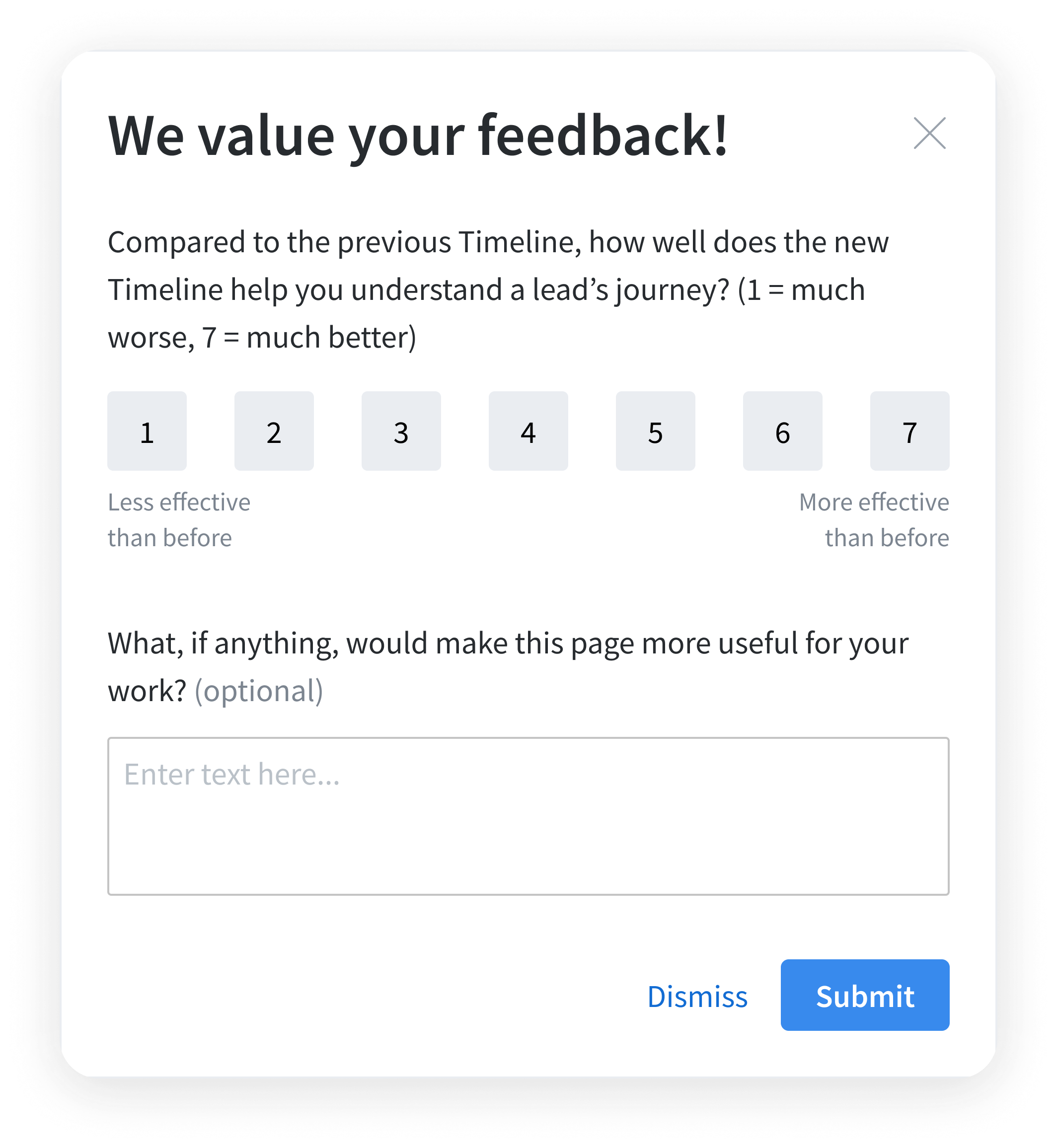
Using Pendo, we surveyed users on their fifth visit to the redesigned Timeline.
---
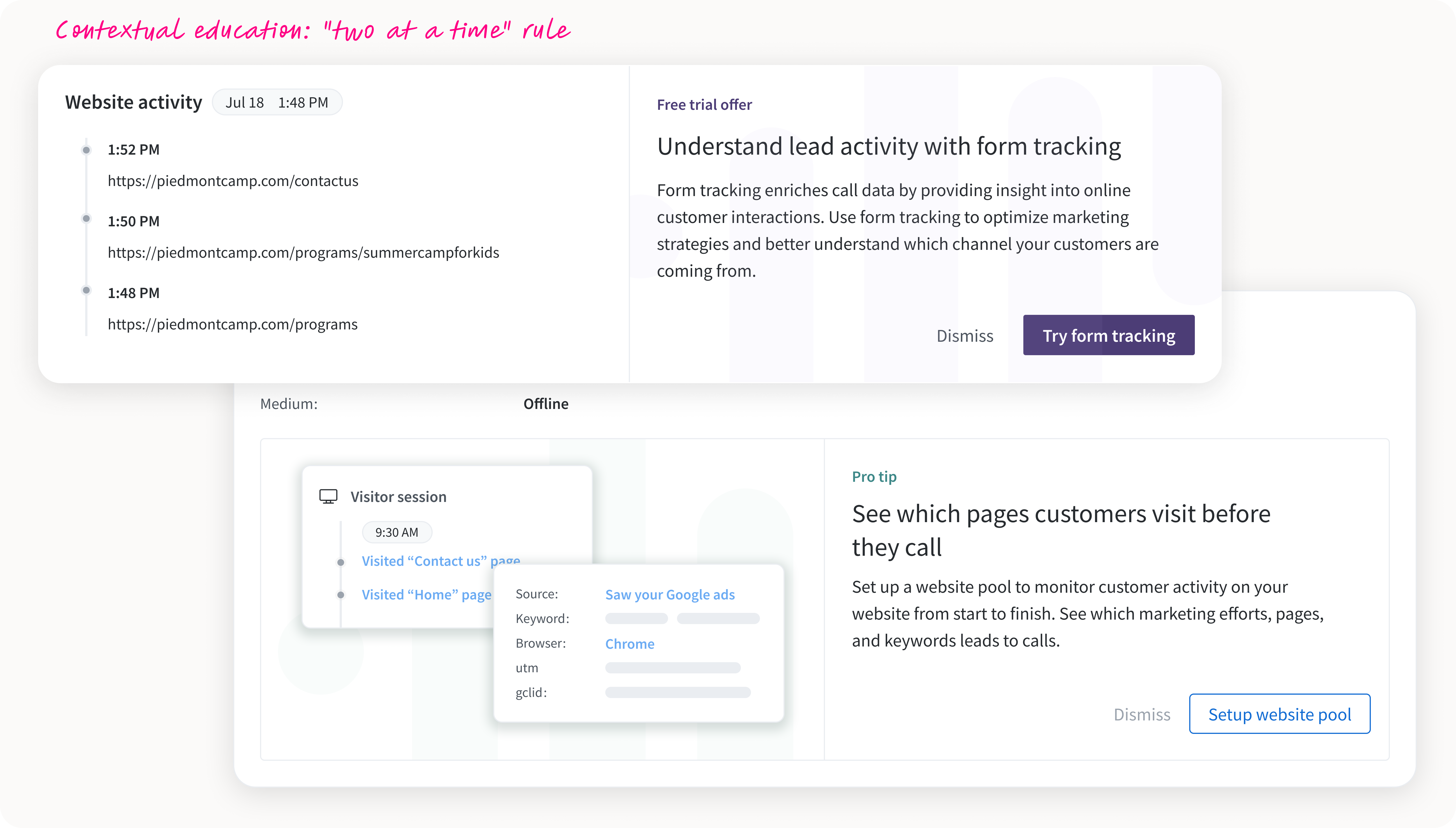
48% call recording activation, unlocking AI features like transcripts and summaries and expanding the addressable audience for our AI suite.
44% conversion on the Premium Conversation Intelligence contextual upsell, one of our highest-performing placements.
Reflection
This project reinforced that data alone does not create value. Timeline already captured the right information, but users could not benefit from it until we made it easier to interpret and tied it directly to their goals.
The biggest takeaway is that growth works best when it surfaces genuinely helpful features. The cards performed best when they appeared in context and clearly explained the benefit. Finally, growth should feel like a natural extension of the product, delivering value for users and for the business.