Guiding new users to successfully optimize CallRail

2023 | Onboarding, First-run experience, Retention,
Hebe Zheng (Lead UX Designer), Heather Lutz (Senior UX Content Strategist), Grant Sadowski (Senior Product Manager), and the Experience Engineering team.
Problem
Our user research and feedback from customer-facing teams revealed that new users often struggle to set up CallRail for their specific business needs. They frequently feel uncertain when first landing on the app's homepage. This presents a significant challenge for CallRail in driving adoption and retention among new customers. The application requires substantial initial setup, creating a catch-22: users need to invest time configuring their account to fully realize CallRail's value, yet they're less likely to do so without immediately seeing that value.
"Have someone walk you through the set up as it can be a little confusing at first. But once you get the hang of it’s pretty easy." - Marketing agency, Feb 2023
Outcomes
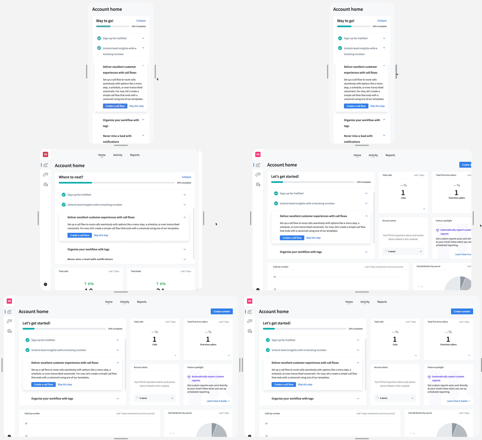
In December 2023, we launched the homepage onboarding checklist to guide new users through CallRail setup, highlight key features, and build confidence through easy-to-follow steps and education. This checklist aimed to boost return on investment for both users and our company by helping new customers quickly grasp CallRail's full value.

To assess its long-term business impact, I compared the average graduation rates between Q2 2023 and Q2 2024. Graduation rates, defined as the percentage of customers who remain after the first 90 days, increased from 86.4% to 88.6% during this period—a 2.55% improvement.
38% higher retention rate for accounts that completed the onboarding checklist
Accounts that completed the checklist are 38% more likely to remain active than those that didn't. However, it's worth noting that users who completed the checklist may have already been more inclined to remain active users.
Design solutions
Responsive variation (tablet and mobile)
Location and layout

Recognizing that new users often feel uncertain and lost when first landing on CallRail's homepage, we strategically placed the onboarding checklist there for maximum impact. As users progress through the checklist, they can directly observe the tangible results on the homepage dashboard.

One of the design challenges here is to ensure that the onboarding checklist blends seamlessly with the homepage's existing layout without disrupting the overall experience.

Onboarding checklist task

To define the optimal onboarding checklist tasks, I used the following approach:

  • Observational analysis: I studied the behavior of our marketing agency customers as they set up accounts for their clients, extracting key patterns and best practices.
  • Internal knowledge mining: I leveraged our Account Executives' guidebook, distilling critical insights on new customer onboarding processes.
  • Collaborative workshops: I conducted action mapping exercises, inspired by 'Better Onboarding' (A Book Apart) with my PM and Content Strategist. This allowed us to deconstruct existing user routines and identify essential onboarding actions for new users.
Designing for emotion

To address new CallRail users' feelings of uncertainty and being overwhelmed during initial account setup, I crafted the following design strategy for the onboarding checklist:

  • Task prioritization: We carefully sequenced the checklist items, balancing task complexity with perceived user value. This approach aims to gradually build user confidence while demonstrating the CallRail’s value.
  • Positive reinforcement: I incorporated visual feedback mechanisms upon task completion. This design element serves to boost user confidence and maintain motivation throughout the onboarding process.
👋 Special note from Hebe
For the purpose of the case studies, I intentionally provided a bird's-eye view of the problem space, solution, and its impact. But there's so much more to explore! If you're curious about the behind-the-scenes design process, let's chat—I'd be thrilled to share more!